
Transform Your Home: The Enduring Charm of Neutral Paint Colors and Inspiring Decor
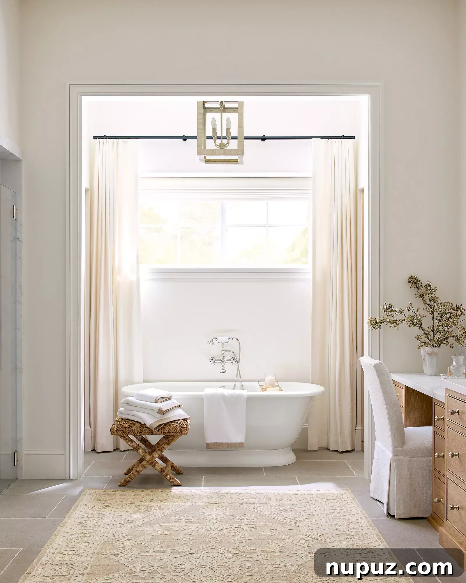
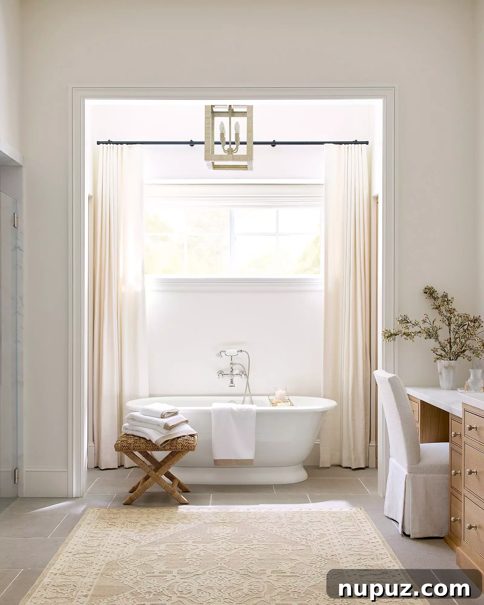
A serene, spa-like bathroom showcasing the beauty of neutral paint colors, design by Serena & Lily.
One of the most impactful yet affordable ways to revitalize your living space is with a fresh coat of paint. Whether you’re aiming to update a single room or reimagine your entire home, selecting the right paint colors is crucial. It can instantly make a room feel more expansive and airy or, conversely, create a wonderfully cozy and intimate ambiance. Among the myriad choices, neutral paint colors stand out as a perennial favorite among designers, offering a timeless and versatile canvas. These subtle shades provide the perfect backdrop for showcasing your cherished art, curated furniture, and unique design elements, allowing them to truly shine without overwhelming the senses.
The Unmatched Versatility of Neutral Paint Colors
Neutral paint colors encompass a broad spectrum of shades, from crisp whites and soft beiges to sophisticated grays and elusive greiges (a blend of gray and beige). Their enduring popularity stems from their incredible versatility and their ability to adapt to various design styles, from modern minimalist to classic traditional. Unlike bold, trending colors that can quickly feel dated, neutrals offer a timeless appeal that remains elegant year after year.
Beyond their aesthetic flexibility, neutrals also offer psychological benefits. They create a calming and harmonious environment, promoting a sense of tranquility and peace within your home. This makes them ideal for spaces where relaxation is key, such as bedrooms and spa-like bathrooms. Moreover, light neutral shades are masters of illusion, reflecting light and making rooms appear larger and brighter, a valuable asset for smaller spaces or those with limited natural light.
Choosing Your Perfect Neutral Palette: Warm vs. Cool Undertones
While neutrals might seem straightforward, they possess complex undertones that significantly influence a room’s mood and appearance. Understanding these undertones is key to selecting the perfect shade for your home:
Embracing Warm Neutrals
Warm neutrals, such as creamy whites, soft beiges, and greiges with subtle yellow or red undertones, create an inviting and comforting atmosphere. These colors evoke a sense of coziness and can make a large room feel more intimate. They pair beautifully with natural wood tones, rich fabrics, and earthy accents, enhancing a rustic or traditional aesthetic. Think of shades like “Alabaster” or “Swiss Coffee” for a gentle, luminous warmth that envelops a space.
Sophistication with Cool Neutrals
Cool neutrals, including grays, cool whites, and greiges with blue or green undertones, lend a crisp, modern, and sophisticated edge to any interior. These shades are excellent for creating a serene and airy feel, often favored in contemporary or minimalist designs. They complement metallic accents, sleek furniture, and crisp white trim, providing a clean and refreshing backdrop. Popular choices might include a light “Revere Pewter” or “Agreeable Gray” for a balanced, chic appeal.
The ultimate decision often comes down to the existing elements in your room—your flooring, furniture, and the quality of natural light. Always test paint samples on your walls and observe them throughout the day to see how the color shifts under different lighting conditions.
Neutrals as the Ultimate Canvas for Inspired Design
The true genius of neutral paint colors lies in their ability to recede into the background, allowing your decorative choices to take center stage. They act as a sophisticated canvas, highlighting the textures, colors, and forms of everything else in the room.
- Showcasing Art: A neutral wall makes vibrant paintings, sculptures, and photographic prints truly pop. The absence of competing color allows the artwork’s details and hues to be fully appreciated.
- Highlighting Furniture: Whether you have a bold statement sofa or antique wooden pieces, neutral walls ensure your furniture’s design and craftsmanship are the focal point.
- Layering Textures: Neutrals provide the perfect foundation for layering different textures—think linen curtains, a wool rug, velvet cushions, or a rattan accent chair. This creates depth and interest without adding visual clutter.
- Introducing Color through Accessories: If you love to change your color scheme with the seasons or trends, neutral walls offer unparalleled flexibility. Simply swap out pillows, throws, vases, and other accessories to refresh your space without repainting.
Designer Tips for Mastering Neutral Paint Application
Even with the seemingly simple choice of a neutral, a few designer-approved tips can ensure a flawless finish and optimal result. As highlighted by experts from sources like Luxe Magazine, selecting the best neutral paints involves more than just picking a pretty shade.
- Sample, Sample, Sample: This cannot be stressed enough. Paint large swatches on different walls in the room you plan to paint. Observe them over several days, under various lighting conditions – morning, noon, evening, and with artificial light. This is the only way to truly understand how the color will appear in your unique space.
- Consider Undertones Carefully: As discussed, knowing if your chosen neutral leans warm or cool is vital. Ensure it harmonizes with your existing flooring, cabinetry, and fixed elements to avoid clashes.
- Choose the Right Finish: The sheen of your paint also impacts its appearance. Matte or flat finishes absorb light, offering a sophisticated, velvety look, often ideal for bedrooms. Eggshell or satin finishes provide a subtle luster and are more durable, making them excellent for living rooms, hallways, and especially bathrooms where moisture resistance is key.
- Prepare Your Walls: A professional finish starts with proper preparation. Ensure walls are clean, smooth, and primed. This is particularly important when switching from a dark color to a light neutral.
Curating Cohesive Spaces with Neutral Tones
Neutral colors are not just for aesthetic appeal; they are powerful tools for creating flow and cohesion throughout your home. By using a consistent neutral palette, you can connect different rooms, making your entire space feel larger and more intentional.
Creating Dream Foyers and Entryways
Your entryway is the first impression of your home. A neutral color scheme here can immediately create a welcoming and elegant atmosphere. Light grays or warm off-whites, paired with a beautiful console table and a piece of art, can instantly elevate the space. Explore inspiring designs like those featured by McGee & Co. to craft an inviting entrance that sets the tone for your entire home.
Serene Living Rooms and Tranquil Bedrooms
In living rooms, neutrals provide a restful backdrop for social gatherings or quiet evenings. They allow for easy integration of diverse furniture styles and decorative accents. For bedrooms, the calming effect of neutrals is paramount. Imagine a bedroom painted in a soft, cool gray with layers of luxurious white bedding, creating a personal sanctuary for ultimate relaxation.

Sophisticated living space demonstrating the depth and texture achieved with a neutral palette.
Beyond Paint: Styling with Neutral Accents and Timeless Pieces
The beauty of a neutral base extends to your choice of accents and furniture. When your walls are calm, you have the freedom to experiment with materials and finishes that add character and warmth.
Consider incorporating rich textures like linen, wool, and natural wood. Metallic accents, particularly vintage brass pieces from retailers like One Kings Lane, add a touch of timeless elegance and warmth, contrasting beautifully with cooler neutral walls. Woven baskets, ceramic vases, and lush greenery also introduce organic elements that further enhance the serene and inviting atmosphere created by your neutral palette. Remember that even within neutrals, layering different shades and textures adds depth and sophistication, preventing a space from feeling flat or sterile.
Escape into a “Summer State of Mind” with Kristy Woodson Harvey
After immersing yourself in the world of home design, perhaps it’s time for a literary escape. Get ready to dive into a heartfelt and captivating story from a master of contemporary fiction.
Prepare for a delightful journey to coastal Carolina with “Queen of the beach read,” New York Times bestselling author Kristy Woodson Harvey. Her latest novel, Summer State of Mind, promises a heartfelt escape filled with new beginnings, unexpected romance, and deep-seated community secrets.
The story introduces us to Daisy Stevens, a burnt-out NICU nurse who, after enduring the worst day of her professional life, flees to the picturesque Cape Carolina in search of a fresh start and perhaps a blossoming romance. However, her quest for a “simpler” life takes an unforeseen turn on her very first day when high school baseball coach Mason Thaysden discovers an abandoned baby. This pivotal event sends ripples of shock and intrigue throughout the close-knit town, intertwining the fates of its residents.
Mason, still grappling with the physical and emotional scars of an injury that dashed his dreams of the big leagues, finds himself rooted in his hometown, yearning for a way out. The sudden arrival of Daisy and the child they’ve collectively saved might just be the motivation he needs to reconsider his desire to leave. Sparks fly as Mason becomes Daisy’s guide to Cape Carolina, introducing her to his circle of friends and family, including his eccentric Aunt Tilley, who herself is seeking solace from long-buried family secrets and an opportunity for her own fresh start.
As Daisy grows increasingly attached to the abandoned child, she’s simultaneously forced to confront her own personal demons. Yet, just as new bonds are forming and old wounds begin to heal, a startling discovery threatens to unravel the fabric of the entire town, placing Daisy, Mason, and Tilley directly in the eye of the storm. In a narrative that solidifies Kristy Woodson Harvey’s reputation as the “go-to for elevated beach reads” (People), these characters will each learn profound lessons. Through the transformative power of love, profound understanding, and even a charming community theater production of Hello, Dolly!, they discover that sometimes, life’s intricate conspiracies lead us exactly to where we truly belong.
Conclusion: Design Your Dreams, Live Your Story
Whether you’re thoughtfully selecting the perfect neutral shade to transform your home into a haven of tranquility or losing yourself in the pages of a compelling novel, the pursuit of beauty and comfort enriches our lives. Embracing neutral paint colors offers an unparalleled foundation for a stylish, serene, and ever-evolving home. It’s an investment in timeless elegance that allows your personal style to shine through, creating spaces that feel uniquely yours. So, pick up that paintbrush or that book, and start crafting the environment and experiences you truly desire.